The presentation of large sets of data in a graphical or pictorial format, such as charts and graphs, is referred to as data visualization. It makes it easier for decision-makers to identify and share new insights, outliers and real-time trends about the information represented in the data.
An interactive dashboard is an information visualization tool used by data scientists, data analysts, and business people to make data-driven business decisions. Dashboards make it easier to sort, filter, and drill into different data types. In a nutshell, data visualization can make it easier to identify what is happening, why it is happening and what should be done next.
It is no secret that the amount of big data is increasing by the day. It is important to use data visualization tools to access insights and make informed business decisions. The benefits of data visualization tools include:
- Quick information absorption and fast decision making
- A better understanding of the steps needed to improve business decision making and processes
- Improved ability to maintain the interest level of your audience with information they can understand
- Easy distribution of information simplifies access and sharing
- As data is more accessible and understandable, the need for data scientists is reduced
- Act on findings quicker with fewer mistakes
Read on to learn more about the data visualization tools that Qlik and Tableau provide.
Also read: Data Visualization Tools: Looker vs. Tableau
Qlik Sense
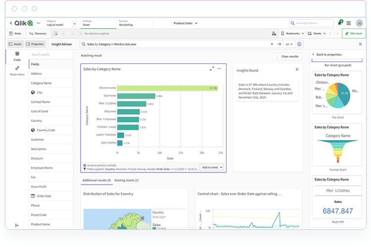
Qlik Sense is a modern cloud analytics tool that empowers you to make data-driven decisions and take appropriate action as and when needed. The solution offers a state-of-the-art analytics engine, powerful artificial intelligence (AI), active analytics, a hybrid cloud platform, and broad use cases.
Key Differentiators
- The solution provides a variety of interactive visualizations and sturdy AI support, including data preparation and association recommendations.
- Qlik Sense’s unique associative data engine enables you to explore data from all angles, directly within the visualization.
- The solution’s cognitive engine uses machine learning (ML) techniques to give you an idea of what to explore next.
- Augmented analytics help you analyze data from angles that may not have been considered.
- The platform can handle large sets of data without degrading performance or increasing cost.
- A variety of application programming interfaces (APIs) help you integrate with web and application technologies, such as edge devices, workflows, portals, and products.
- You can draft reports with a simple drag-and-drop mechanism.
- With fully data-driven alerting and automation, you can immediately react to changes in data.
- A fully functional mobile experience enables you to explore data and generate insights on the go.
Pricing: Fill out a form to try Qlik Sense Business for free. The data visualization software is available for $30 per user, per month and is ideal for small and mid-sized organizations. Qlik Sense Enterprise SaaS is perfect for large organizations. Contact sales for pricing information.
Tableau Desktop
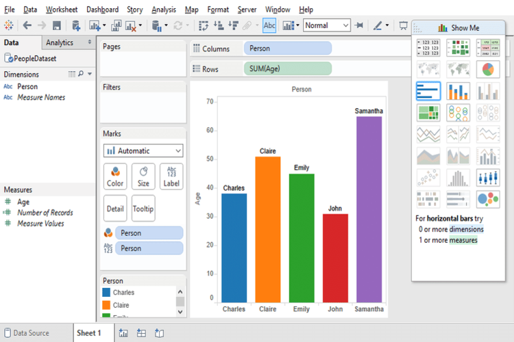
Tableau Desktop enables you to answer questions at the speed of thought. You can obtain actionable insights in a quick manner, connect to more data, answer deep questions, put data on the map, and leverage live stories among other features.
Key Differentiators
- With live visual analytics, you can get actionable insights quickly, as they fuel limitless data exploration.
- Interactive dashboards help you discover insights that may be hidden to the naked eye.
- The data visualization tool makes use of the natural ability of people to spot visual patterns.
- You can access and combine dissimilar data from multiple sources, be it on-premises or in the cloud, without writing code.
- Evaluate statistical summaries, drag and drop reference lines and forecasts, and speedily develop robust calculations from existing data.
- You can make a point with correlations, regressions, and trend analyses for tried and true statistical understanding.
- With Tableau Maps, you can create interactive maps with built-in features.
- Live stories enable you to create a compelling narrative that inspires thought and questioning.
Pricing: You can download a 14-day free trial, and students or teachers can obtain a free 1-year license. Tableau Desktop is a part of the Tableau Creator plan and is available for $70 per user, per month. The plan also includes Tableau Prep Builder and one Creator license of Tableau Online or Tableau Server.
Qlik Sense vs. Tableau Desktop
Here is a head-to-head comparison of Qlik Sense and Tableau Desktop.
| Features | Qlik Sense | Tableau Desktop |
| Ability to Understand Needs |  |
|
| Pricing Flexibility | |
|
| Ease of Deployment | |
|
| Availability of Third-party Resources | |
|
| Ease of Integration Using Standard Tools and APIs | |
|
| Quality of End-user Training | |
|
| Interactive Visual Exploration | |
|
| Analytics Dashboards | |
|
| Publishing Analytic Content | |
|
| Embedding Analytic Content | |
|
| Governance and Metadata Management | |
|
| Data Source Connectivity | |
|
| Security and Use Administration | |
|
| Self-service Data Preparation | |
|
| Ease of Use for Content Creators and Consumers | |
|
| Service and Support | |
|
| Willingness to Recommend | |
|
| Overall Capability Score | |
Choosing Data Visualization Tools
It is apparent from the table that both Qlik Sense and Tableau Desktop are polished solutions. Qlik Sense provides several features, including self-service visualization, interactive dashboards, alerting and action, reporting, mobility, and advanced analytics.
Tableau Desktop’s key features include live stories, Tableau Maps, exceptional analytics, multiple data source connectivity, and interactive dashboards.
This guide should serve as the first step in your journey to find a worthy data visualization tool for your organization. Read product catalogs with a keen eye, reach out to an expert (if necessary), and request and review pricing packages before making a purchasing decision for your data visualization software.
Read next: Best Data Visualization Tools & Software 2021
The post Qlik vs. Tableau 2022: Data Visualization Tool Comparison appeared first on Enterprise Networking Planet.
