Data visualization is the graphical representation of data and information. By using visual elements like maps, graphs, charts, tables, infographics, and dashboards, data visualization software offers an accessible path to view and understand patterns, outliers, and trends in data.
Given how we created an astonishing 2.5 quintillion bytes of data daily in 2020 (yes, 18 zeroes!), data visualization software and technologies are an important component of businesses today, as they facilitate data-driven decisions by analyzing data.
Data visualization is essentially storytelling with a purpose and is much-needed in the age of big data. Data visualization tools help you:
- Uncover insights and see the big picture
- Make better, data-driven decisions
- Share insights and present meaningful data
- Democratize data
In this article, you will learn about Looker and Tableau’s data visualization tools.
Also read: Data Democratization: Key Strategies for Your Business
Looker
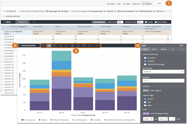
Data visualizations by Looker and Google Cloud enable you to tell better and brighter stories with your data, effectively helping you bring insights to life. By turning data into insights, you can make better business decisions.
Key Differentiators
- Looker’s data visualization software helps you maximize the potential of data and present a persuasive story with tools that allow for deeper data analysis.
- The software’s interactive and dynamic dashboards and data visualizations can provide you with the flexibility to examine your data in greater detail while helping you maintain a secure, eagle-eyed view of business operations.
- Looker offers a streamlined, user-friendly workflow to take action out of insights.
- You can access a single Looker dashboard for multiple experiences. Dashboards can be set up to dynamically filter for individuals or groups.
- Looker offers a library of visualizations to view data. These include funnel, maps, gauge multiple visualization, timeline, donut multiples, sankey, treemap, and combined charts.
- You can create a visualization of your own as well—Looker will add it to your workflow.
Pricing: You can test-drive a Looker dashboard and experience the data visualization tool in action. Request a quote by filling out a simple form.
Tableau
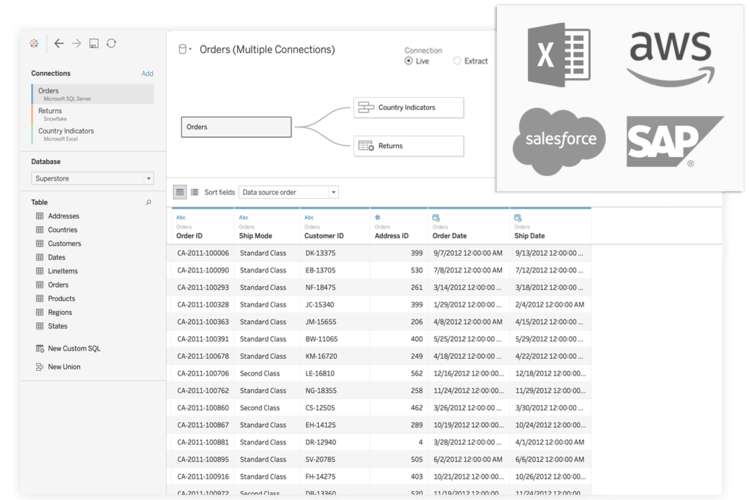
Tableau Desktop provides limitless data exploration through an intuitive and dynamic interface, encouraging data-driven decision making, creativity, and curiosity. You can employ statistical modeling with a click, powered by artificial intelligence (AI); create visualizations with a simple drag-and-drop mechanism; and ask questions using natural language.
Key Differentiators
- Leverage the power of interactive dashboards to get actionable insights quickly. The software harnesses the natural ability of users to spot visual patterns.
- You can connect to data on-premises or in the cloud, be it cloud applications like Salesforce and Google Analytics, a spreadsheet, a SQL database, or big data.
- The solution allows you to answer deeper questions. You can review statistical summaries, drag-and-drop forecasts, and reference lines and rapidly build powerful calculations from existing data.
- Identify opportunities, spot trends, and ask new questions to make data-driven business decisions with Tableau Desktop.
- With Tableau Maps, you can create interactive maps complete with built-in postal codes for over 50 countries.
- With Tableau Desktop, you can replace static slides with live stories that compel others to ask their own questions and extend the impact of your insights.
Pricing: Tableau Desktop is a part of the Tableau Creator package and is billed annually at $70 per user, per month. The package also includes Tableau Prep Builder and a solitary Creator license on Tableau Online.
Looker vs. Tableau
We compared the data visualization tools on a head-to-head basis:
| Features | Looker | Tableau Desktop |
| Ability to Understand Needs |  |
|
| Pricing Flexibility | |
|
| Ease of Deployment | |
|
| Availability of Third-party Resources | |
|
| Ease of Integration Using Standard Tools and APIs | |
|
| Quality of End-user Training | |
|
| Interactive Visual Exploration | |
|
| Analytics Dashboards | |
|
| Publishing Analytic Content | |
|
| Embedding Analytic Content | |
|
| Governance and Metadata Management | |
|
| Data Source Connectivity | |
|
| Security and Use Administration | ||
| Self-service Data Preparation | |
|
| Ease of Use for Content Creators and Consumers | |
|
| Service and Support | |
|
| Willingness to Recommend | |
|
| Overall Capability Score | |
Choosing Data Visualization Software
From the above table, it is evident that Looker is a versatile data visualization tool. While Looker is the preferred consumer choice, Tableau Desktop also provides several noteworthy features that make it a solution worth surveying.
Analyze both data visualization software and purchase the solution that best meets the use cases of your organization. Determine their features and pricing, go through honest customer reviews (both positive and negative), and request a product demo if necessary.
Read next: Best Data Visualization Tools & Software 2021
The post Data Visualization Tools: Looker vs. Tableau appeared first on Enterprise Networking Planet.
